Mobile App Redesign For iOS
U.S. Bank – Personal Project
Summary
Objective: The primary objective for this project was to take an application with undesirable functionality, and redesign the look and feel of the main features and pages. I list the main issues, as well as my proposed solutions. I also made sure to retain every function each page offered.
Duration: One Day
Methods: Sketches, wireframes, & prototype
Tools: Adobe XD & Adobe Photoshop
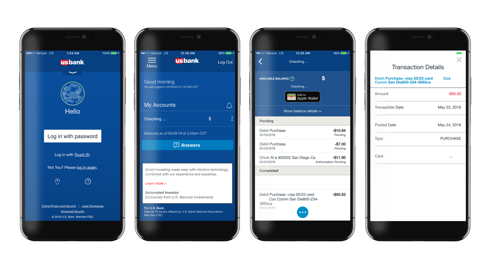
Original U.S. Bank iOS App
Note: All bank information was excluded from the original screenshots. Also, all of the prototype bank information is example figures for the purpose of representation.
Primary Issues
#1 Issue: The home page has several obscure options that the user may look past or be confused when using the app. For example, the location icon at the bottom left is used to locate nearby branches. A normal user will most likely not know that.
#2 Issue: The account page was unorganized and had various options below the accounts that didn’t fit in well.
#3 Issue: The account summary page lists transactions with very inconsistent information about the purchase location, and sometimes not at all.
#4 Issue: When viewing a transaction, the details open in a separate window. The functionality works fine, but a more intuitive interface would make for a better user experience.
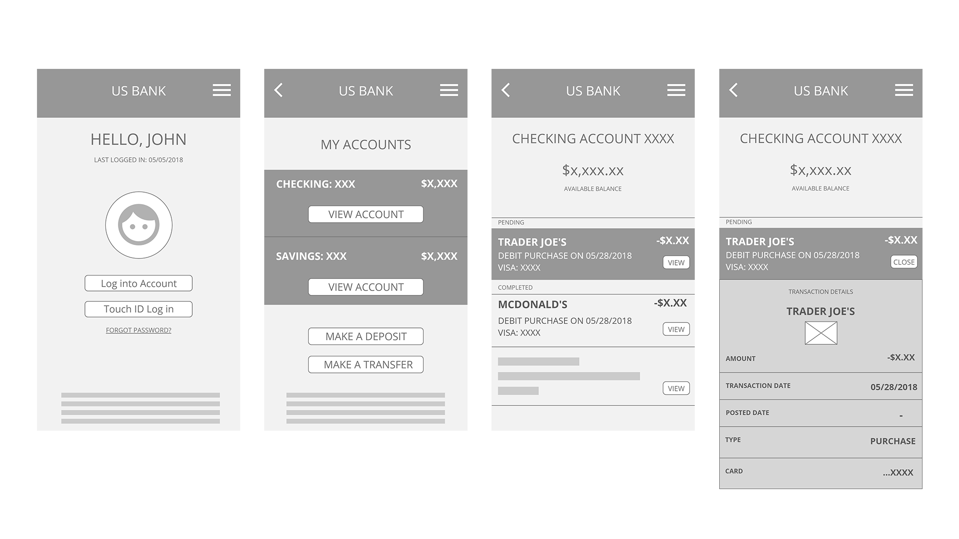
Wireframes
I created wireframes in Adobe XD to organize my workflow before starting on the prototype. I changed many of the original ideas, but the layout stayed the same, for the most part.
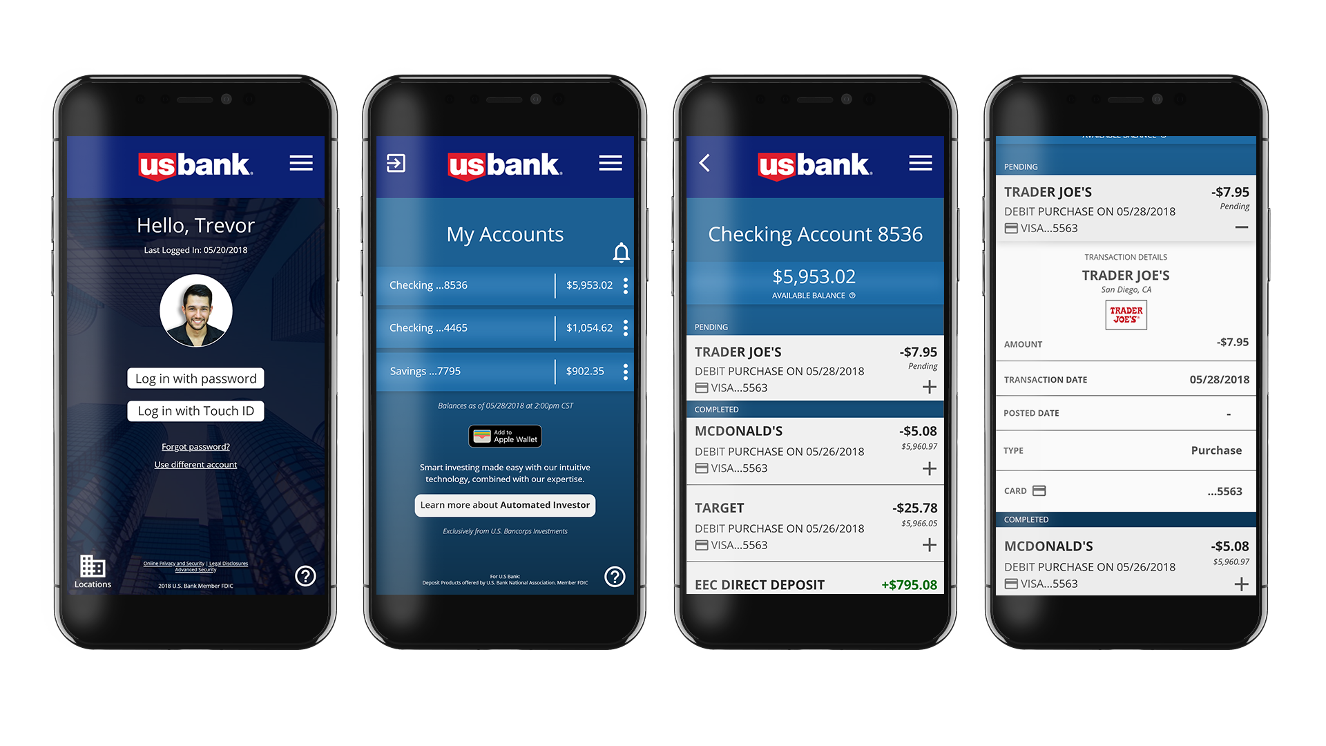
Prototype
I created a functioning prototype that re-imagines most of the main pages, and offers a more organized and fluid experience.
Solutions
#1 Solution: I cleaned up the home page, and a used more identifiable icons for all of the functions.
#2 Solution: I organized the account page by moving most of the elements around. I also made the ad at the bottom less of an eyesore, but still retaining its purpose.
#3 Solution: On the account summary page, I made the individual transactions information more understandable, and used a uniform format for all of the details.
#4 Solution: I changed the functionality for viewing a transaction. Instead of a separate page for individual transaction details, the information now expands and retracts when the user presses on the transaction.